Editorial Blink Shoot

jt8c0569-editblog.jpg

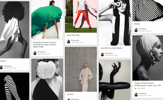
This past weekend I had a the privilege of leading a styled shoot for photographers from all around the country attending Blink Conference. I centered the concept around contrasting color. Check out a snippet of the pin board below. Screen Shot 2014-11-11 at 8.32.42 AM

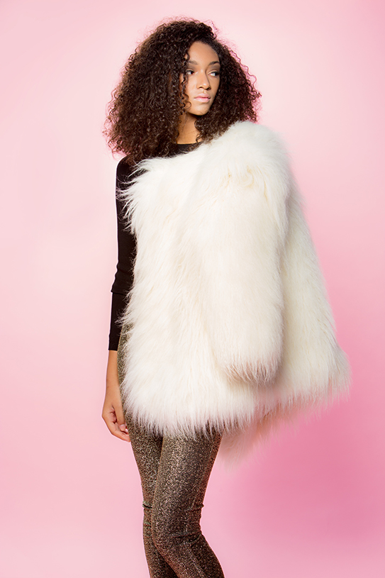
With big hair, a bubble gum pink backdrop, a killer model and some bold clothes you really can't go wrong.

jt8c0484-editblog

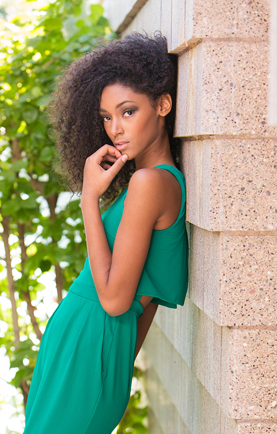
Bright green, black, gold and white were all colors that went will with the pink back drop, but they also pop in natural settings.

jt8c0540cropblog

I jumped in front of the camera once or twice to show off some sequins and my "This is my party dress" tank from Junk in the Trunk Vintage Apparel. You can pre-order your tank or sweatshirt starting today!!! Click here.

jt8c0443blog

Big thanks to Ryan Walsh Photography for these photos and Savage Universal for the seamless backdrop.

Hair and makeup by Miriam Kenly and Jaclyn Cipolla from Leidan Mitchell Salon. Styling and art direction by A.V.E. Styles.

Look 1: Black off-the-shoulder top from Junk in the Trunk Vintage Apparel, tulle skirt from Lulu*s

Look 2: Faux fur coat from H&M, gold pants from H&M

Look 3: Green jumper from H&M

Look 4: Sequin jacket from Anthropologie, tank from Junk in the Trunk Vintage Apparel, and pants from Macy's.

How to Look Web-Cam Ready

IMG_2286.jpeg

In one week I'll be presenting about Pinterest strategies for hundreds of stylish bloggers and business owners for Alt on Topic. I couldn't be more excited to share my Pinterest knowledge, but I'm so nervous about giving a talk online. I've never done it before, and I am just praying I don't have any technical difficulties. One thing that has crossed my mind is what I should wear and how I should dress for my talk. Let's be honest, web cameras make everyone look terrible. Whenever I see my face using Skype and Facetime I just try to look away because I feel like the wide angle distorts my face a bit. After thinking about what to wear and how to impress for my presentation, I decided I needed some help in the makeup department. I asked my dear friend, Stephanie Neieheisel, to show me how to create a face that is web-cam ready, and we thought this would be great advice for all of you too! You can check out the video below, and don't forget to subscribe to her YouTube channel for more makeup tips!

Of course, makeup isn't the only thing that can help you make a great impression. Check out my latest eBay guide sharing accessory tips to help you look great for an online date. And, if you're interested in attending this one day webinar head on over to Instagram to win a ticket to Alt on Topic.

DIY Credenza & Chalk Art

diycredenzapin.jpg

For three years I've known I wanted to build a "fauxdenza" in our kitchen. When I saw the DIY originally on The Brick House, I knew it was the perfect solution for our insanely long wall in the kitchen. We have a 1950's ranch home that lacks storage, and this credenza would not only serve as a decorative bar, but as a place to store placemats, napkins, vases and other nicknacks that you collect over the years. credenzabeginning2 credenza1

We started with Ikea kitchen cabinets. We bought four of them to span 10 feet. We chose the matte white doors (your cheapest option) and followed the shopping list on The Brick House's blog (below). We followed the installation instructions and asked my father-in-law to help Ryan since the cabinets are pretty heavy and the process is time consuming.

FAUXDENZA (from The Brick House)

Dimensions: 10′ long x 13-1/2″ deep x 33″ tall

Materials from Ikea:

8  -  Applad Doors (15 x 18″) 4  -  Akurum Wall Cabinets (30 x 18″) 8  -  Integral Hinge (2 pack) 2  -  Akurum Suspension Rail

credenzaedge

The wood we chose to float on the top and sides of the cabinets is poplar from The Home Depot. The top is one continuous piece of wood that was cut to size by the lovely people at Home Depot. It was stained with Minwax's golden oak and sealed with Minwax's clear satin finish (also found at The Home Depot).

credenzaside

We had our friend Mason install the wood because he is a professional handyman, and we had one shot at fitting the wood.

credenzafinal

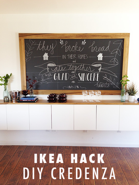
Such a long piece of furniture calls for a large piece of art work. We decided chalk art would complement the rustic quality of the wood. Chasing Paper makes a stickable chalk paper that was easily to apply. You can see the process in the photos below.

chasingpaperblogchasingpaper4

We simply measured the area, cut the paper and stuck it to the wall.

chasingpaper1

For the chalk art I asked my friend Katie Sterbenz to create a custom drawing of the verse in Acts that says, "They broke bread in their homes and ate together with glad and sincere hearts." I thought it was the perfect message for the kitchen because that's what Ryan and I really want our home to be all about - a place to enjoy community and celebrate the great things God has done.

chasingpaper3chasingpaper2

Katie used a transparency and overhead projector to help her. She used several different sized chalk pens to draw everything. You can purchase this print (in a smaller size) for your home and others when you visit her Etsy shop.

You can see how incomplete everything was without the wood on the shelves and the wood around the art. We had Mason create a frame for Katie's piece with the same poplar wood. We stained it with the golden oak color to match the credenza.

credenzafinal2finalcredenza1

A Kitchen Engagement Styled Shoot

MelissaJill_007.jpg
View More: http://melissajill.pass.us/kitchenengagment

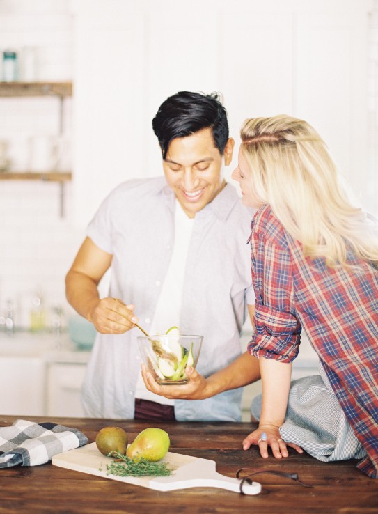
They say a way to a man's heart is through his stomach, and I say the way to a woman's heart is a man cooking for her.

In my seven years of marriage there have been a handful of times when Ryan has cooked for me, or shall I say "attempted" to cook for me. All of those times I have felt so loved and cared for because I know that's not a strength of his, and yet he was doing it purely to help me and show me that he was thinking of me. Those acts of service in our marriage are the sweetest things to me and to many women.

View More: http://melissajill.pass.us/kitchenengagment

The way Ryan feels the most loved is good espresso or coffee and conversations with me. That's exactly how our dating relationship began, and that's something that has stayed with us over the years. I have a gold member card at Starbucks to prove it to you. haha.
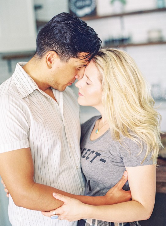
This engagement shoot is all about the simple ways we love one another in relationships - making food together, reading the paper together, drinking coffee together, cuddles and conversations.
View More: http://melissajill.pass.us/kitchenengagment

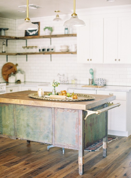
As a stylist, I have styled many engagement sessions for real couples and for inspiration, and lately I've just gotten tired of trying to think of the next coolest, most-unique shoot to do. When Melissa Jill approached me to do a styled engagement session to celebrate her new branding I started to think of a unique concept and nothing really came to me...and then it hit me, why not just do it a beautiful home, with good food and keep it simple and authentic.

View More: http://melissajill.pass.us/kitchenengagment

I gathered some wonderful women in my life who are SO creative and also value simplicity and realness. Coley Arnold and Lindsey Holt created a beautiful environment, Jessica Helgeson style and made the tasty food, Stephanie Neiheisel created a natural face, Malori Maeva gathered wild flowers and green that you could pick from your backyard, and I gathered comfortable and beautiful vintage pieces from GrowOp to style Liz and Cesar. Liz and Cesar are a married couple, so the emotion in these photos is totally real. I think that makes a huge difference.

View More: http://melissajill.pass.us/kitchenengagment

Melissa did an amazing job capturing the shoot and intimacy. She used film for the first time, and I'm so proud of her. The light and warmth is gorgeous. Go read her blog post and check out her brand new website!

View More: http://melissajill.pass.us/kitchenengagment

How to Style a Sweatshirt

Alex-7-web.jpg

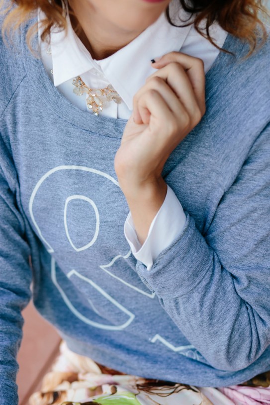
Nothing says fall and football season like a sweatshirt. It's the comfiest and coziest piece of clothing I own next to my plush bathrobe, and I can actually wear it out of the house. Anything with the word "sweat" in it doesn't sound fashion forward at all, but what if I told you that you could actually wear the most comfortable thing in your closet and look fashion forward? Are you listening?...

Alex-4 web
Alex-4 web

I bet you are! Here are two ways to style your sweatshirts - one of the tomboy and one for the feminine gal.

Alex-13 web
Alex-13 web

1. The tomboy option: Boyfriend jeans, button down shirt underneath, heels and a jeweled necklace. The heels and the necklace dresses up this very casual outfit - balancing the tomboy flair with some femininity.

Alex-11 web
Alex-11 web

Get this look from Shop & Apparel! 

Alex-2 web
Alex-2 web

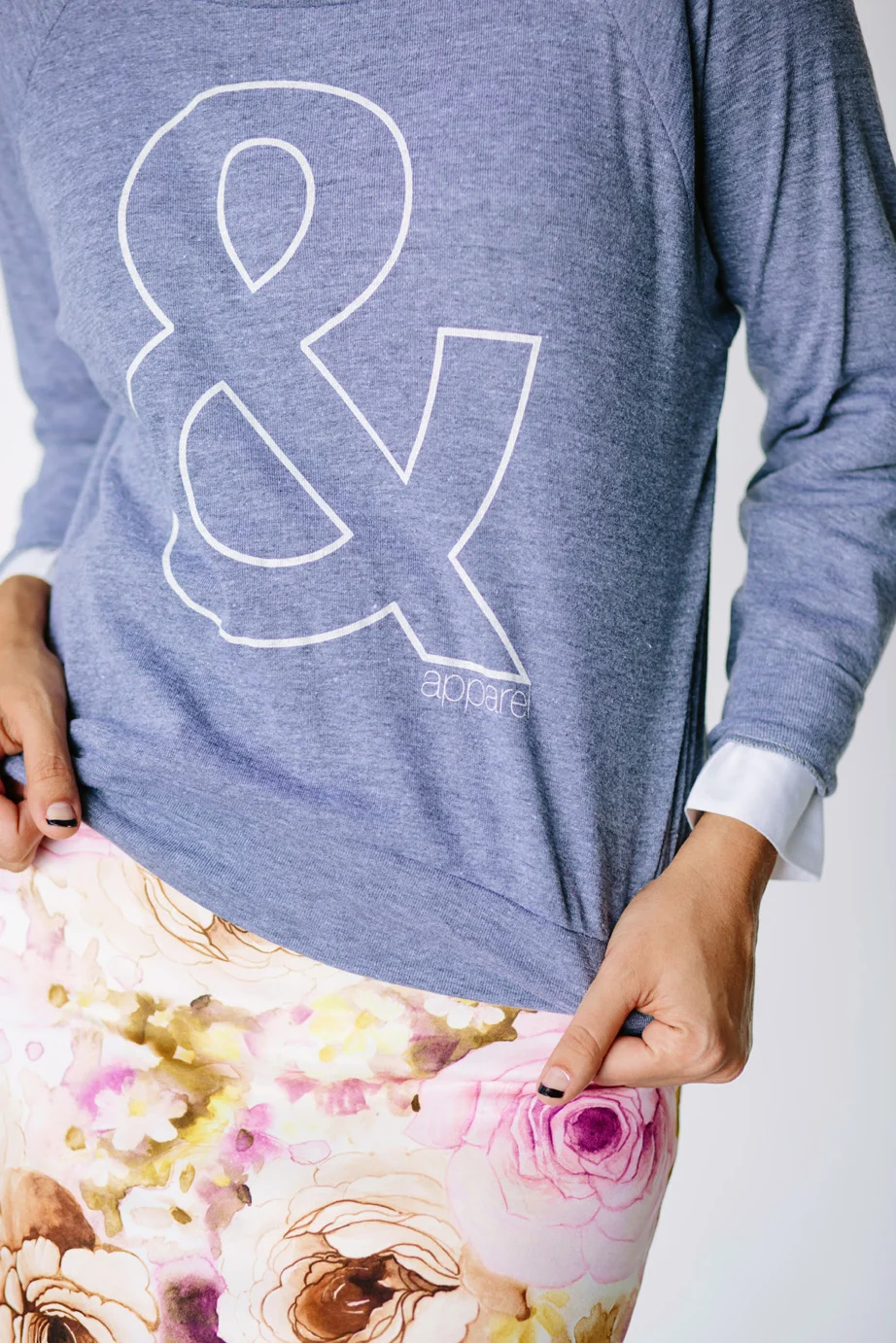
2. The femme option: Floral pencil skirt, button down shirt underneath, jeweled necklace and booties. Pencil skirts are everywhere right now, and I especially love this one with the sweatshirt. The addition of a colorful pattern is pleasing to the eye. You could wear heels with this or you could wear booties like I am. Either way it's a fashionable outfit that you could wear out with your friends.

Alex-10 web
Alex-10 web

Get the look: Sweatshirt, pencil skirt, necklace all from Shop & Apparel's latest fall collection. Make sure to go check them out. They have stylish closet staples for great prices!

Photos by Michelle Herrick.